Support our educational content for free when you purchase through links on our site. Learn more
What Are the 4 Main Types of Pattern in Design? 🎨

The four main types of pattern used in design are regular, irregular, flowing, and progressive. They describe how visual motifs repeat or change; other familiar labels—like geometric, floral, and abstract—describe what a pattern looks like.
That distinction can save a design from a classic mix-up. A floral pattern can be regular, while a geometric pattern can flow along a curve. We’ve seen the same principle help app and game teams: choose the motif for the mood, then choose its arrangement for the rhythm.
Key Takeaways
- Regular patterns repeat motifs in a consistent, orderly arrangement.
- Iregular patterns vary the placement or spacing to feel more spontaneous.
- Flowing patterns guide motifs along curved or directional paths.
- Progressive patterns change gradually in size, color, shape, or spacing.
- Geometric, floral, and abstract describe pattern families—not the same four arrangement types.
- In apps and games, patterns can add personality and visual structure, but readability should come first.
Table of Contents
- ⚡ Quick Tips and Facts
- 🎨 What Does “Pattern” Mean in Design?
- 🕰️ A Brief History of Patterns in Art and Design
- 🔍 The 6 Main Types of Pattern Used in Design
- 1. Geometric Patterns
- 2. Organic and Natural Patterns
- 3. Abstract Patterns
- 4. Motif-Based and Figurative Patterns
- 5. Regular and Repeating Patterns
- 6. Iregular and Random Patterns
- 🧩 Pattern Elements: Motifs, Repeats, Scale, and Rhythm
- 🖼️ How Patterns Are Used in Graphic Design
- Branding, Packaging, and Marketing
- Web Design, UI, and Digital Products
- Textiles, Interiors, and Product Design
- 🛠️ How to Choose the Right Pattern for Your Design
- ✏️ How to Create a Seamless Pattern
- 🚫 Common Pattern Design Mistakes to Avoid
- 💡 Pattern Design Tips for Better Visual Impact
- 🔄 Design Patterns vs. Patterns in Design: What’s the Difference?
- ✅ Conclusion
- 🔗 Recommended Links
- ❓ FAQ
- 📚 Reference Links
⚡ Quick Tips and Facts
Short answer: “The four main types of pattern used in design” depends on which classification you mean. For visual art and graphic design, one useful system groups patterns as regular, irregular, flowing, and progressive. Other sources classify patterns by what they depict—such as geometric, floral, animal, or abstract—or by how motifs repeat.
That distinction matters. A floral pattern can also be regular; a geometric pattern can flow along a curve. These labels describe different aspects of a pattern, not always mutually exclusive boxes.
| Quick fact | What it means |
|---|---|
| A pattern is built from repetition | A motif, shape, line, color, or texture repeats to create visual structure. |
| There isn’t one universal “four-type” taxonomy | Classifications vary by whether they describe arrangement, subject matter, or repeat behavior. |
| Four useful arrangement types | Regular, irregular, flowing, progressive—a practical visual-design framework. |
| Six useful motif families | Geometric, heritage textile, floral/botanical, animal, abstract/modern, cultural/regional—a broader vocabulary for identifying what a pattern looks like. |
| Patterns affect usability, not just style | In apps and games, visual repetition can guide attention, separate content, and establish atmosphere—but busy patterns can reduce readability. |
| Software design patterns are a different topic | Coding design patterns are reusable solutions to recurring software-design problems, not decorative repeats. |
A helpful distinction from AND Academy’s overview of pattern in design is its four-part arrangement framework: regular, irregular, flowing, and progressive. Meanwhile, Pattern Weaver’s pattern guide sorts visual patterns into families such as geometric, botanical, and heritage textile. Both classifications can be useful because they answer different questions.
At Stack Interface™, we see the same distinction in app and game work: “What is the motif?” and “How does it repeat?” are separate design decisions. Keep that in mind—the categories become much easier to use once we separate them.
🎨 What Does “Pattern” Mean in Design?
A design pattern is a repeated visual element or arrangement. That repeat might be obvious, like a checkerboard, or subtle, like a faint texture behind a mobile app screen.
The repeated unit is called a motif. It could be a flower, a geometric shape, a line, an icon, a color block, or even a small illustration. Repeat the motif, vary it, or arrange it along a path, and you create a pattern.
The Tate’s art glossary describes pattern in terms of repeated decorative design. In practical design work, repetition can also organize information and create rhythm—not merely decorate a surface.
Pattern, motif, texture, and rhythm
| Term | Meaning | Example |
|---|---|---|
| Motif | The basic visual unit | One leaf, star, or app icon |
| Pattern | A repeated organized arrangement of visual elements | Leaves tiled across a screen |
| Texture | The perceived or actual surface quality | A grainy background or woven fabric |
| Rhythm | The visual beat created by repetition and variation | Dots that grow closer together |
| Seamless repeat | A tile that joins its edges without a visible break | A repeating wallpaper or game background |
These ideas overlap, but they are not interchangeable. A texture may be irregular and non-repeating; a pattern may be crisp and geometric. And rhythm can come from repeating elements even when no single tile is obvious.
Why designers use patterns
Patterns can:
- Create visual interest without adding more content.
- Communicate personality, from playful polka dots to formal damask.
- Establish hierarchy by helping a section or screen feel distinct.
- Suggest motion in a game environment or animated interface.
- Support recognition through repeated brand colors or motifs.
- Add depth and texture to otherwise flat graphics.
But repetition has a volume knob. Turn it up too far and the pattern competes with the message. For mobile interfaces especially, the content should remain the star—not the wallpaper.
🕰️ A Brief History of Patterns in Art and Design
Pattern is older than digital design by several thousand years. People have used repeated marks and motifs in textiles, ceramics, architecture, printmaking, and decoration across many cultures. The V&A’s collection offers a vivid view of how textile pattern reflects materials, techniques, trade, and cultural traditions.
Industrial printing and manufacturing made repeat designs easier to reproduce at scale. Later, graphic design, digital illustration, and software tools made it possible to create, test, and adjust patterns quickly.
From craft traditions to screen design
A pattern’s history often carries meaning beyond its appearance. Plaids and tartans, for example, have specific cultural associations; the Scottish Register of Tartans documents registered tartans and their connections. Paisley motifs have a long history across Persian and South Asian textiles, while Arts and Crafts designers such as William Morris drew inspiration from intricate botanical forms. The V&A’s William Morris collection provides historical context for that work.
That history is useful—not as a permission slip to borrow any motif, but as a reminder to understand what you’re using. Pattern Weaver puts the principle plainly: “Use them knowledgeably — study the tradition, honor the context.” That’s a good rule for designers, developers, and anyone making an “inspired by” mood board.
Patterns meet apps and games
In digital products, patterns have two jobs:
- Visual communication: textures, backgrounds, illustrations, and brand motifs.
- Interaction structure: repeated interface conventions, such as card layouts or navigation bars.
The second use can be confusing because software development also uses the phrase design pattern. Those are reusable code-level approaches, a separate subject we’ll distinguish below.
For a visual introduction to pattern as an element of art and design, the featured video, “Understanding the Visual Elements – PATERN”, by Art Bites, is a quick primer. It’s the third video in a series about the visual elements of art and design, and its 3:11 runtime makes it an easy watch before you start sketching repeats.
🔍 The 6 Main Types of Pattern Used in Design
The question asks for four types, but a useful guide should make room for more than one classification system. Below are six broad visual pattern families, followed by the four arrangement types that directly answer the common “four types” question.
This is not a contradiction. Geometric, floral, and abstract describe what a pattern is made of; regular, irregular, flowing, and progressive describe how its elements are arranged or change. A floral repeat can be regular, irregular, flowing, or progressive.
| Pattern family | What defines it | Common examples | Often used for |
|---|---|---|---|
| Geometric | Lines, shapes, grids, and symmetry | Stripes, checks, chevrons, polka dots | Branding, packaging, UI surfaces |
| Heritage textile | Established textile styles or craft traditions | Damask, toile, plaid, ikat, paisley | Fashion, interiors, editorial design |
| Floral and botanical | Plants, flowers, leaves, and natural forms | Ditsy florals, tropical leaves, botanical illustrations | Packaging, fabric, stationery |
| Animal | Animal markings or illustrated creatures | Leopard spots, zebra stripes, repeated birds | Fashion, games, playful branding |
| Abstract and modern | Nonliteral compositions of color, shape, and texture | Terazo, fluid forms, Memphis-inspired shapes | Contemporary graphics, apps, packaging |
| Cultural and regional | Motifs associated with particular places or traditions | Moroccan motifs, mandalas, regional textiles | Context-sensitive editorial and product design |
Pattern Weaver’s six-family approach is helpful when you want to describe a visual style. Its four-family shorthand—geometric, floral/botanical, animal, and abstract/modern—is a simplification, not a universal standard. Heritage and cultural patterns deserve separate attention because their meanings and origins may not be captured by a purely visual label.
1. Geometric Patterns
Geometric patterns use recognizable shapes, lines, and mathematical or grid-like arrangements. Think stripes, dots, checks, diamonds, hexagons, and repeating arcs.
| Example | How to recognize it |
|---|---|
| Chevron | V-shaped lines meet at clean points |
| Herringbone | Short, offset lines form a broken zigzag |
| Checkerboard | Alternating squares create a grid |
| Greek key | Repeated angular meanders form a border |
| Quatrefoil | Four rounded lobes create a clover-like motif |
Geometric patterns are easy to scale and often work well in digital layouts because their structure can align with grids. But tiny, high-contrast geometry can shimmer or feel visually noisy on screens. Test it at actual display size, not just zoomed in on a large monitor.
2. Organic and Natural Patterns
Organic patterns are inspired by plants, landscapes, clouds, water, and other natural forms. Their shapes tend to feel less rigid than geometric ones, even when the repeat itself is carefully constructed.
Examples include:
- Leaves, vines, and blossoms
- Marble-like veining
- Waves, clouds, and riples
- Wood grain and stone textures
- Branching or cellular forms
“Organic” describes the visual character, not necessarily the subject. An abstract pattern can feel organic if it uses flowing, irregular shapes. And a botanical print can still be arranged on a strict grid.
3. Abstract Patterns
Abstract patterns use color, shape, line, or texture without depicting a clearly identifiable subject. They can be orderly, playful, expressive, or deliberately chaotic.
Examples include:
- Color fields and overlapping circles
- Memphis-inspired compositions
- Terazo-like speckles
- Fluid gradients and marbling
- Repeated marks or brush strokes
Abstract patterns are useful when you want atmosphere without telling viewers exactly what they should see. In game interfaces, for example, an abstract background can suggest energy or mystery while leaving the gameplay information legible.
4. Motif-Based and Figurative Patterns
Motif-based patterns repeat recognizable objects or images: flowers, animals, stars, household objects, characters, or symbols. “Figurative” patterns often include representational illustrations, while a motif can be any repeated visual unit.
Common examples include:
- Floral and botanical prints
- Animal prints and repeated creatures
- Toile-style scenic illustrations
- Stars, hearts, and icons
- Character patterns in games and merchandise
The key design choice is not just what the motif depicts, but how often it appears and at what scale. A tiny repeated character can feel like texture; one oversized character can become the focal point.
5. Regular and Repeating Patterns
A regular pattern repeats its motifs in a consistent, predictable arrangement. Rows, columns, evenly spaced dots, and precise tile grids all qualify.
✅ Benefits: order, clarity, easy production, and reliable visual rhythm.
❌ Drawbacks: it can feel rigid or monotonous if the design needs movement or spontaneity.
Regular repeats are especially useful for backgrounds, surface design, and structured interface decoration. In app design, use them where they won’t interfere with text or controls.
6. Iregular and Random Patterns
An irregular pattern repeats motifs while varying spacing, orientation, size, or placement. It may look spontaneous, but effective irregularity is often carefully art-directed rather than truly random.
✅ Benefits: energy, naturalism, and a less mechanical appearance.
❌ Drawbacks: uneven density can make one area feel heavy or create accidental visual clutter.
“Random” does not mean “without rules.” Designers often set boundaries—such as a limited palette, maximum motif size, or minimum spacing—so the variation feels intentional.
Four arrangement types: regular, irregular, flowing, and progressive
For the direct four-part answer, AND Academy describes patterns by their arrangement and behavior:
| Arrangement type | How it works | Simple example | Visual effect |
|---|---|---|---|
| Regular | Motifs repeat in a consistent order and spacing | Evenly spaced circles | Calm, structured |
| Iregular | Motifs repeat with varied spacing or placement | Scattered leaves | Casual, lively |
| Flowing | Motifs follow a curved, winding, or directional path | Vines following a curve | Movement, rhythm |
| Progressive | A motif changes gradually across the repeat | Dots growing larger | Transition, development |
This framework answers “What are the four main types?” when the question is about arrangement. If it’s asking what a pattern depicts, use motif families such as geometric, botanical, animal, and abstract instead.
🧩 Pattern Elements: Motifs, Repeats, Scale, and Rhythm
A pattern works because several elements cooperate. Think of it as a small visual system: the motif is the component, the repeat is the layout rule, and scale and rhythm determine how the system feels.
| Element | Design question | Practical effect |
|---|---|---|
| Motif | What is repeated? | Sets the subject and personality |
| Repeat unit | What portion of the artwork tiles? | Determines whether seams are visible |
| Scale | How large are motifs relative to the surface? | Changes prominence and legibility |
| Density | How much space sits between motifs? | Controls visual busyness |
| Direction | Does the pattern have an up/down orientation? | Affects cropping and placement |
| Color contrast | How strongly do elements stand apart? | Influences readability and emphasis |
| Rhythm | Is repetition steady, varied, or changing? | Creates calm, energy, or movement |
Scale changes the message
A tiny motif can read like texture; the same motif enlarged can become the main subject. Pattern Weaver captures this well: “The same motif whispers at 2 cm and shouts at 20 cm.”
For a mobile app, check a pattern at the size it will actually appear. A detailed repeat that looks elegant at full resolution may collapse into visual noise on a small phone. For a game, inspect it both during play and in motion; movement can make a subtle pattern harder to parse.
Repeat structures at a glance
| Repeat approach | Description | Good for |
|---|---|---|
| Straight repeat | Motifs align in rows and columns | Grids, checks, orderly surfaces |
| Half-drop repeat | Alternate rows shift by half a motif | Florals, less rigid tiling |
| Brick repeat | Rows offset like bricks | Stripes, illustrations, natural motifs |
| Directional repeat | Motifs face or flow in one direction | Borders, backgrounds, fabric |
| Scatter repeat | Motifs distribute with controlled variation | Casual, organic-looking designs |
Designers sometimes call these repeat methods or tiling structures. They are not the same thing as the four pattern arrangement types. One describes the tile geometry; the other describes the visual behavior.
🖼️ How Patterns Are Used in Graphic Design
Patterns can help a design feel cohesive, recognizable, and finished. They can also create contrast between sections or give a brand a distinctive visual signature. The trick is knowing when pattern should lead and when it should stay in the background.
Branding, Packaging, and Marketing
Brand patterns can extend a visual identity beyond a logo. A company might reuse a distinctive shape, color combination, or illustration style on packaging, social posts, or event materials. Adobe’s guide to visual identity explains how consistent visual elements help establish a recognizable brand system.
When designing a brand pattern:
- Start with an element that already belongs to the brand.
- Set rules for spacing, scale, color, and allowed variations.
- Test the pattern on real packaging or screens, not only on an artboard.
- Keep decorative elements from obscuring product information.
- Consider accessibility and legibility when patterns sit behind text.
A pattern can make packaging more distinctive, but it should not make labels harder to read. For regulated or safety-related information, clarity wins.
Web Design, UI, and Digital Products
In web and app interfaces, patterns usually work best as supporting graphics: a low-contrast page background, a branded empty state, a subtle card texture, or a decorative section divider.
The W3C’s WCAG contrast guidance sets minimum contrast requirements for many text and interface elements. Patterned backgrounds can make that contrast inconsistent from one part of a screen to another, so place text on a stable surface or test the lowest-contrast area.
For development teams, a pattern should be implementable as well as attractive. Consider:
- Asset size: Can a small tile repeat instead of shipping a huge image?
- Rendering: Will scaling blur a raster pattern?
- Motion: Does animated pattern distract or affect performance?
- Responsive behavior: Does the repeat still look intentional on narrow screens?
- Accessibility: Can users read, focus, and interact with content above it?
If your team is building reusable UI systems, our Coding Best Practices resources can help connect visual consistency with maintainable implementation.
Textiles, Interiors, and Product Design
In textiles and interiors, pattern scale, direction, repeat, and material all interact. A pattern that looks subtle on a small swatch can dominate a full wall or sofa. Pattern Weaver’s guide usefully contrasts product contexts: garments often benefit from non-directional prints, while wallpaper can carry larger-scale statements.
| Application | Pattern considerations |
|---|---|
| Clothing | Direction, repeat visibility, seam matching, and movement |
| Wallpaper | Scale, repeat distance, room size, lighting |
| Stationery | Print quality, edge alignment, and motif density |
| Product surfaces | Material, wear, manufacturing tolerances |
| Digital backgrounds | Screen size, contrast, compression, and legibility |
A reliable test is simple: preview the pattern on the real object, at real size, under realistic lighting or display conditions. The swatch is a trailer; the finished surface is the full movie.
🛠️ How to Choose the Right Pattern for Your Design
The best pattern is not automatically the prettiest one. It’s the one that supports the design’s purpose, audience, medium, and content.
A practical selection checklist
- Define the job. Is the pattern decorative, informative, branded, or meant to create atmosphere?
- Choose a visual family. Geometric, botanical, animal, abstract, heritage, or cultural/regional?
- Choose an arrangement. Regular, irregular, flowing, or progressive?
- Match the medium. Screen, fabric, packaging, wallpaper, or game environment?
- Set scale and density. Check both the motif size and the space between motifs.
- Check contrast. Make sure important text and controls remain easy to see.
- Test real-world use. Preview the repeat at its final size, crop, and viewing distance.
- Review cultural context. Research the source and meaning of motifs before using them.
Match pattern tone
| Desired impression | Patterns to explore | Watch out for |
|---|---|---|
| Orderly and modern | Grids, stripes, simple geometry | Overly sterile repetition |
| Friendly and playful | Dots, gingham, small illustrative motifs | Too many competing colors |
| Heritage or formal | Damask, tartan, paisley, Greek key | Using culturally specific motifs without context |
| Bold and contemporary | Large geometry, abstract forms, animal prints | Pattern overpowering the product |
| Natural and calm | Botanical, organic, flowing motifs | Low contrast that becomes muddy |
| Energetic or game-like | Directional, progressive, high-contrast patterns | Distraction during gameplay |
A recurring design-team debate is “Should the pattern be noticed?” Our answer: decide deliberately. A background pattern can be nearly invisible while still giving a screen texture; a promotional graphic may need the pattern to be the star.
✏️ How to Create a Seamless Pattern
A seamless pattern repeats without obvious gaps or seams at the tile edges. The process is easier when you treat the tile as a system rather than a one-off illustration.
Step-by-step workflow
- Pick a motif and purpose. Decide what the repeat should communicate and where it will appear.
- Choose the repeat structure. Start with a straight, half-drop, brick, or scatter layout.
- Set the tile size. Use the smallest practical tile that preserves the desired detail.
- Place motifs with edge behavior in mind. Anything that crosses one edge must continue at the opposite edge.
- Check spacing and density. Look for accidental gaps, clusters, or tangencies.
- Test the tile in a larger field. Repeat it several times in both directions.
- Review at final size. Check readability, color, and visual rhythm on the actual product or screen.
- Export for the medium. Choose an appropriate vector or raster format and test it in the target application.
Seamless-pattern troubleshooting
| Problem | Likely cause | Fix |
|---|---|---|
| Visible line at tile edge | Edge motifs do not align | Match positions across opposite edges |
| Repeated “rows” look too obvious | Grid alignment is too rigid | Try half-drop or brick offsets |
| Pattern feels crowded | Motifs are too large or dense | Reduce scale or increase spacing |
| Pattern looks dull | Too little contrast or variation | Adjust color, size, orientation |
| Pattern becomes noisy on mobile | Detail is too fine for display size | Simplify motifs and test at device scale |
Common tools include Adobe Illustrator, Adobe Photoshop, and Procreate. For game and app assets, vector artwork can be useful when the pattern needs to scale; raster textures can better when you need painterly detail. The right choice depends on the visual style and implementation constraints.
🚫 Common Pattern Design Mistakes to Avoid
Even a beautiful motif can misbehave once repeated. Here are the common troublemakers:
- Ignoring the final scale: The pattern looks good in a zoomed-in preview but fails on the actual product.
- Making every element compete: Motifs, colors, and background all demand attention.
- Using pattern beneath important text: Uneven contrast harms readability.
- Treating “random” as careless: Uncontrolled placement creates awkward clumps and gaps.
- Forgetting cropping: A phone screen, package edge, or fabric seam may cut motifs in strange places.
- Overlooking cultural meaning: A motif may have context beyond its decorative appearance.
- Mixing too many pattern families: A page can become a visual sock drawer.
- Failing to test motion: In games and animated interfaces, repeating textures may shimmer or distract.
For text over a patterned surface, keep a solid or sufficiently opaque backing where needed. Don’t ask users to decode a button while a busy chevron pattern is tap-dancing behind it.
💡 Pattern Design Tips for Better Visual Impact
Use these practical checks to make patterns feel intentional:
- Limit the palette. A compact color system often keeps a busy motif under control.
- Create a hierarchy. Choose one dominant motif, then let supporting elements recede.
- Vary with purpose. Change scale, rotation, or spacing to create rhythm—not noise.
- Leave breathing room. Negative space is part of the pattern.
- Check light and dark themes. A pattern that works on white may disappear on dark surfaces.
- Test accessibility. Review text and UI contrast wherever patterns appear.
- Preview on devices. Check common screen sizes and orientations.
- Use patterns consistently. A repeated brand motif can help tie together otherwise different screens.
- Respect context. Research traditional patterns before adapting or remixing them.
For interface teams, patterns should support the design system rather than become an exception nobody can reproduce. Our AI in Software Development and Back-End Technologies sections cover broader implementation topics that can help teams ship cohesive products, while Data Science can inform experimentation and product evaluation.
🔄 Design Patterns vs. Patterns in Design: What’s the Difference?
Here’s the terminology trap: patterns in visual design are not the same as software design patterns.
| Phrase | Meaning | Example |
|---|---|---|
| Pattern in visual design | Repeated shapes, motifs, colors, or textures | A floral background or geometric tile |
| UI pattern | A recurring interaction or interface solution | Tab navigation or a search bar |
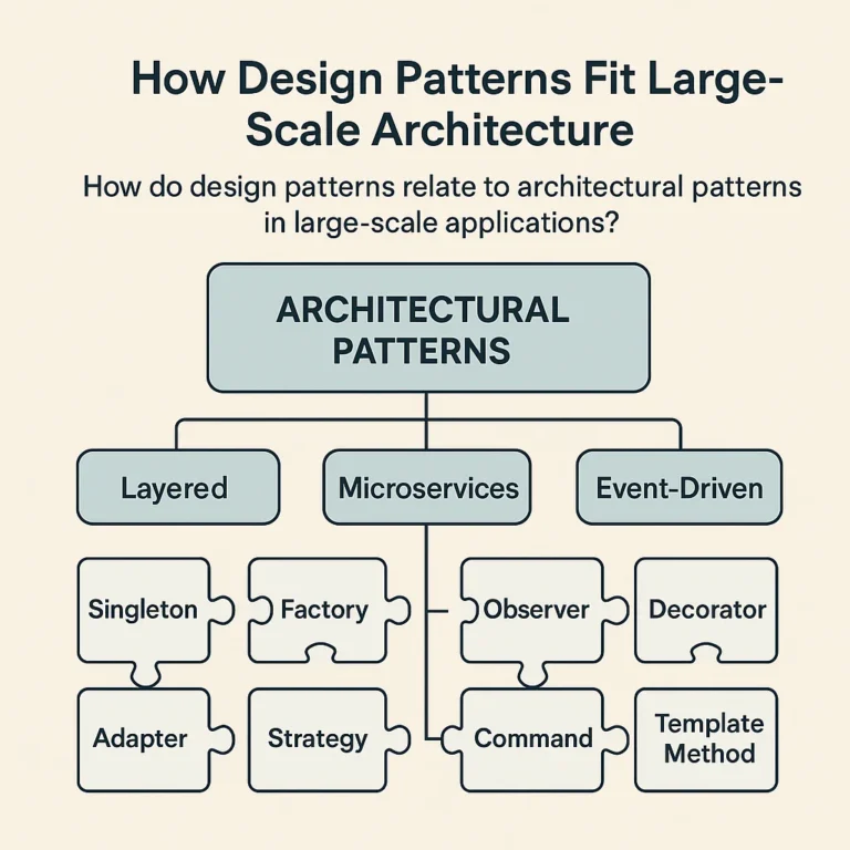
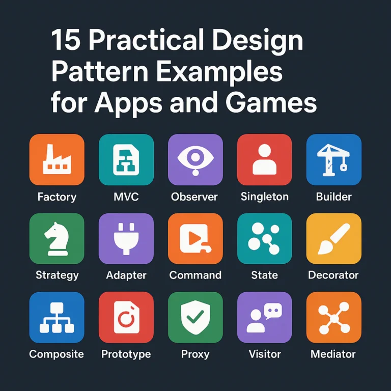
| Software design pattern | A reusable approach to a recurring code-architecture problem | Factory Method or Observer |
The Gang of Four (GoF) book Design Patterns: Elements of Reusable Object-Oriented Software popularized 23 software design patterns in three categories: creational, structural, and behavioral. Refactoring.Guru’s overview explains these categories and their common examples.
Some guides, including DesignGurus’ answer about the four basic categories, add concurrency patterns as a fourth practical category. That can be a useful broader grouping, but it is not the original GoF classification. The sources differ because one is describing the classic catalog, while the other expands the taxonomy to include patterns for coordinating concurrent work.
The four software-design categories in that broader grouping
| Category | Main concern | Examples |
|---|---|---|
| Creational | How objects are created | Factory Method, Builder, Abstract Factory |
| Structural | How components are composed | Adapter, Decorator, Facade, Composite |
| Behavioral | How objects communicate and share responsibilities | Strategy, Observer, Command, State |
| Concurrency | How work is coordinated across threads | Producer-Consumer, Thread Pool, Read-Write Lock |
For app and game developers, these patterns can help teams manage complexity—but they are not visual pattern categories. A game may use a geometric background and the Observer pattern in its event system. One shapes pixels; the other shapes code. Different tools, same word.
Sources: